Mash Up Article
[Architecture] manipulate[s] the eye to create suspense [where] design should mesh with humanity's uniqueness, not the other way round. Dramatic curves [created through] composite manufacturing function [to] tell the body to approach, climb, explore, “so you have a craving to see the statue—and then you see her.”. She subvert[s] the way you [think] about Architecture, creat[ing] living quarters that were unique rather than embracing style. Like a living map, designers create these increasingly intricate facades, which were both useful but stood out for their bizarrity, [to] push the boundaries of engineering. Curved, man-made landscape[s], follow the idea [that] architecture should be [dynamic], rolling out in front of you, like a living map.
http://www.newyorker.com/magazine/2016/05/16/adriaan-geuzes-governors-island
http://www.arthistoryarchive.com/arthistory/antidesign/
http://compositesmanufacturingmagazine.com/2016/05/growing-potential-for-frp-composites-in-architecture-market/
18 Sketch Perspectives
Textures
 |
| These moveable panes that can be adjusted by an individual enhances this idea of architecture as a living map, somthinging that can be adjusted by its occupants |
Two Moving Elements
This moving element it dictated by nature. As light hits the metal wall they expand to open and allow for natural ventilation and a stream of sunlight to flow through. This solidifies the theory that architecture should be living and breathing, just like a living map.
This moving element is dictated by the individual. As these panes moves, panels of opaque, mirrored and transparent panes reflect and refract light, to create an expanding effect for the light. This idea emphasises that architecture is made for the human senses that crave exploration and stimulation.
Two Draft Lumion Environments
Developed Lumion Environment
Entrance is purposefully blank to create a mindset that this architecture school in an unwritten map waiting to be completley unfolded by the students.
 |
| Exterior view throughout day |
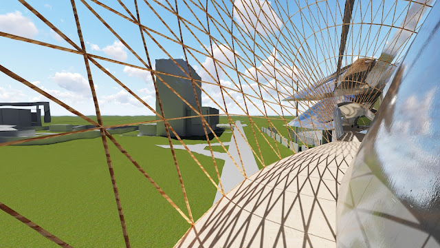
| Exterior view of the building. Inspired by the Guggenheim, these metal curves push the boundaries of that materiality. As the sections rise and fall like a folding map, the different spaces, both horizontally and vertically, create a visual playground for the individual. |
 |
| View from the library/Labs/Research Space. This communal environment over looks the floor below it to promote interaction with Architecture as she lives throughout the day |
Shadows seen in this image create a sense of movement and curiosity, as the undulating curves encourage the individual to "explore".


